Condenson: A Display Font That Fits Tight Spaces With Grace
I was halfway through building a landing page for a boutique ceramics studio when I hit the classic “too much headline, too little space” moment. Their tagline—“Hand-thrown in Portland, shipped with care”—was meaningful but long. The hero section had a subtle clay-texture background and needed breathing room, not visual clutter. That’s when I pulled up Condenson.
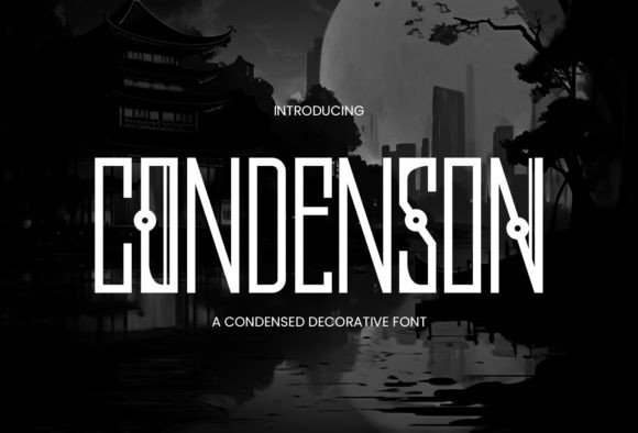
Right away, its condensed form felt like a quiet revelation. Not cramped or forced—just intentionally lean. Condenson is a modern display font built for impact without sprawl. Its letterforms are tall, slightly tapered, with clean terminals and balanced spacing that holds up even at smaller sizes. There’s a quiet confidence to it: no sharp edges, no exaggerated quirks—just refined geometry and rhythm. It doesn’t shout. It commands attention by being effortlessly clear.
In that ceramics project, I dropped Condenson into the hero headline at 48px on desktop and watched how cleanly it sat above the image. No awkward line breaks. No need to shrink the font or truncate the message. On mobile? At 32px with modest tracking, it remained legible and anchored—no squinting, no horizontal scrolling. That’s rare for a condensed display font. Most either collapse into illegibility or demand excessive letter-spacing to breathe. Condenson strikes a balance: tight enough to conserve space, open enough to invite reading.
It’s especially effective where space is precious and tone matters: product landing pages with stacked value props, coaching websites highlighting core offerings (“Clarity. Confidence. Consistency.”), portfolio sites labeling case studies, or course sales pages anchoring key benefits. I’ve used it for banner text over muted photography, for CTA buttons with subtle hover lift, and even as decorative accents in email headers—always as a headline or short phrase, never body copy. It’s not meant for paragraphs. It’s meant to frame, focus, and elevate.
Readability holds up across contexts—but with nuance. On light backgrounds, Condenson shines with crisp contrast. Over darker images or gradients, I added a soft white stroke (1px) or subtle drop shadow—not heavy, just enough to ensure separation. For small CTAs or mobile navigation labels, I stuck to its Medium or Bold weight (it includes six weights total), avoiding Light or Thin in functional UI spots. And yes—I tested it on an old iPad and mid-tier Android device. No rendering hiccups. Webfont files loaded fast, and the variable version (if available) gave me smooth weight transitions for interactive states.
Pairing Condenson is intuitive. I almost always pair it with a warm, neutral sans serif—think Inter, Manrope, or Poppins—for body text and interface labels. Their openness balances Condenson’s density. For more editorial or luxury-leaning projects (like a slow-living blog or artisanal subscription service), I’ve paired it with a restrained serif—Cormorant Garamond or Literata—for pull quotes or section intros. The contrast works because Condenson doesn’t compete; it sets the stage. It says, “This matters,” while letting supporting type do the work of guiding and explaining.
One thing I checked before committing: licensing. Condenson is a commercial font, and the license clearly covers web use, client projects, SaaS interfaces, and digital templates—no surprise restrictions. It supports Latin-based languages out of the box, with thoughtful OpenType features like ligatures and stylistic alternates (great for logo lockups or social banners). No hidden costs, no “personal use only” fine print. That peace of mind matters when you’re shipping design systems or white-labeling brand kits.
Where does it shine most? In moments where hierarchy needs to feel intentional—not just big vs. small, but *focused* vs. *expansive*. A course sales page using Condenson for the main headline (“Design Systems, Simplified”) and a clean sans for bullet points instantly signals structure and credibility. A portfolio site using it for project titles (“Oak & Ember Studio — Identity System”) gives each case study weight without visual noise. Even in email subject lines previewed on mobile, its condensed shape helps the full message stay visible—no ellipsis truncation.
That said, it’s not a universal fix. I wouldn’t use Condenson for navigation menus with more than five items—it’s too dense for scanning at scale. Avoid pairing it with other condensed or geometric fonts (they’ll fight for dominance). And while it handles uppercase beautifully, lowercase settings require extra attention to line-height and tracking—especially below 24px.
What surprised me most was how quickly it shaped the brand’s voice. Before Condenson, the ceramics site felt politely minimal. After? Confidently curated. Not flashy—just unmistakably intentional. That’s the quiet power of a well-chosen display font: it doesn’t add words, but it adds meaning.
If you're choosing a font for a hero section, a campaign banner, a shop header, or a digital brand kit, ask yourself: Does it need to say more with less? Does it need to feel premium without pretension? Does it need to hold its own on mobile, over texture, and beside simpler type? If yes—Condenson isn’t just another display font. It’s spatial intelligence, baked into typography.
And honestly? It made that ceramics landing page ship two days faster. Sometimes the right font isn’t just about looks—it’s about removing friction, clarifying intent, and letting your content land exactly as it should.