Twoarak: A Display Font That Lifts Your Digital Brand
Last week, I was finalizing the hero section of a new landing page for a creative coaching practice — clean layout, warm photography, intentional whitespace. But something felt off in the headline. The current sans serif was legible, yes, but it wasn’t *speaking*. It lacked presence. So I pulled up my font library and typed “Twoarak” into the preview panel. Within seconds, the headline snapped into focus — not louder, but more *alive*. That’s when I knew: Twoarak isn’t just another display font. It’s a visual tone-setter.
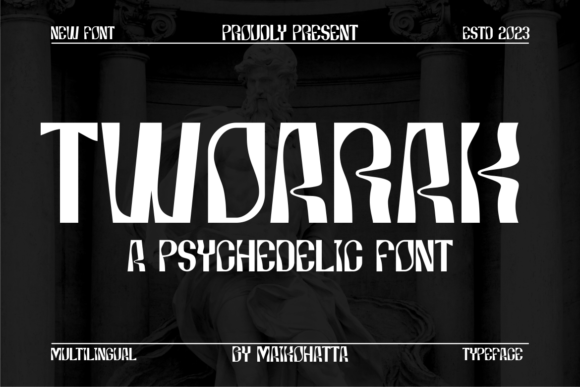
Twoarak has this energetic, almost kinetic rhythm — sharp angles softened by subtle curves, uneven baselines that suggest motion without chaos, and generous letter spacing that breathes on screen. It’s abstract enough to feel fresh, yet grounded enough to read instantly at large sizes. As a display font, it’s built for impact: hero titles, section headers, call-to-action banners, course launch announcements, and shop homepage banners. I used it for the main headline (“Clarity Starts Here”) and the subhead (“A 6-week coaching journey for purpose-driven creators”) — both set over a soft gradient background. No extra effects needed. Just Twoarak, proper weight, and thoughtful line height.
What surprised me most was how well it held up across devices. On desktop, its contemporary design shone in bold weight — confident but never aggressive. On mobile, I switched to the medium weight with slightly increased tracking (letter spacing), and it remained crisp and legible even at 32px. No blurriness, no rendering hiccups. I tested it over image overlays too — a muted photo of hands sketching — and the contrast stayed strong thanks to Twoarak’s open counters and sturdy stroke contrast. For dark mode previews, I paired it with a light gray (#f0f0f0) instead of pure white, and it retained warmth without glare.
But here’s the practical truth: Twoarak isn’t meant for paragraphs. Or navigation menus. Or tiny footer links. It’s a spotlight font — best reserved for moments where you want attention, intention, and emotional resonance. I used it exclusively for:
- The primary headline and secondary tagline in the hero
- Section headers like “How It Works” and “What You’ll Gain”
- Button text on the CTA card (“Reserve Your Spot”) — set in medium weight, all caps, with 8px letter spacing for extra punch
- Logo lockup in the site header (as part of a custom wordmark — not standalone, but integrated)
For everything else — body copy, captions, form labels, testimonials — I kept it simple: Inter, loaded via Google Fonts. Its neutral, highly readable sans serif quality creates perfect balance. That pairing is where Twoarak truly shines: it doesn’t compete, it complements. You get energy up top, clarity below. I’ve also tested it successfully with modest serif fonts like EB Garamond for blog headers or email newsletter subject lines — giving editorial depth without sacrificing modernity.
Before dropping Twoarak into the live build, I double-checked the webfont package. It includes WOFF2 (ideal for performance), multiple weights (Light, Regular, Medium, Bold), true italics (not skewed), and basic Latin + extended Latin character sets — enough for English, Spanish, French, and German content. No ligatures or stylistic alternates cluttered the set, which I appreciated; clean implementation matters when you’re optimizing for Core Web Vitals. Licensing was straightforward — a standard commercial license covering websites, SaaS dashboards, and digital templates. No surprises there.
Readability-wise, Twoarak rewards smart usage. On light backgrounds, it’s vibrant and direct. On dark, go one weight heavier than usual — the Bold holds its shape beautifully. Avoid cramming it into narrow columns or small buttons under 44px tall; its personality needs room. I skipped using it for inline links or form placeholders — those need predictability, not flair. And while it works in SVG-based social graphics and branded email headers, I wouldn’t use it for app UI labels or dashboard cards where scanning speed trumps style.
I also tested it in a few other real contexts: as a banner font for a boutique online store’s seasonal collection (“Summer Edit”), where its abstract geometry echoed the product photography’s minimalist framing; in a portfolio site’s project title cards, where it added distinction without overshadowing the work; and in a digital brand kit PDF, where its consistent hinting ensured clean PDF export at any zoom level. In each case, it elevated the perception of care and intention — not “designed,” but *considered*.
One thing I noticed early: users don’t “read” Twoarak the way they read body text. They *register* it. That’s by design. Its strength lies in quick recognition and mood-setting — signaling creativity, forward motion, and human-centered thinking. That makes it especially effective for coaching sites, course sales pages, campaign landings, and creative studios where tone is half the message. It doesn’t shout “look at me.” It says, “this is worth your attention.”
If you’re choosing a display font for your next digital project, ask yourself: does it support your brand’s voice *and* your users’ experience? Twoarak does both — when used with restraint and respect for hierarchy. It’s not a Swiss Army knife, and it shouldn’t be. It’s a precision tool: expressive, contemporary, and quietly confident. And in a sea of safe, algorithmically optimized type choices, that kind of thoughtful distinction? That’s what makes a website feel human.