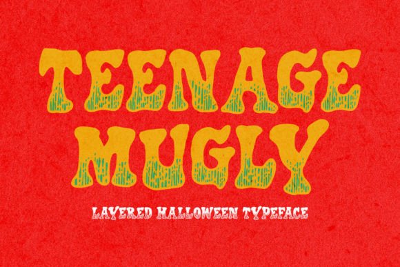
Teenage Mugly: A Display Font with Bite
First glance at Teenage Mugly isn’t polite—it’s a smirk, a raised eyebrow, a deliberate shrug. This isn’t a font that asks permission to exist. It’s jagged where it wants to be, uneven where it chooses, and unapologetically restless in its rhythm. The letterforms feel hand-drawn but not careless—there’s craft in the controlled chaos: sharp terminals, irregular stroke contrast, and a slight forward lean that suggests motion, even in stillness. It doesn’t whisper confidence; it cracks a joke mid-sentence and waits for you to catch up. Its personality? Witty, slightly irreverent, fiercely youthful—but never childish. Think indie zine meets boutique skincare label, not middle-school yearbook.
Where Teenage Mugly Earns Its Place in Real Projects
In logo design, Teenage Mugly shines when the brand voice is deliberately off-kilter—think vinyl record shops, ceramic studios, independent bookstores, or sustainable apparel lines targeting Gen Z and younger millennials. It works best as a primary mark or short brand name (3–5 words max), not a full tagline. I’ve used it successfully on matte-finish product labels for small-batch candles and kombucha—its texture reads beautifully next to tactile paper stocks and minimalist photography.
For packaging design, it adds instant character without needing extra illustration. On a kraft box for handmade soaps, Teenage Mugly stood out against neutral backgrounds while feeling cohesive—not loud for loudness’ sake, but *present*. In editorial design, it anchors feature headers in print zines and digital newsletters where tone matters more than neutrality. It’s not for body text, of course—but as a pull-quote treatment or section divider, it creates memorable punctuation.
Social media graphics benefit most when restraint is applied: one line of Teenage Mugly over a muted photo, sized large, left-aligned with generous breathing room. On Instagram carousels or Pinterest pins, it stops scrollers—not because it’s flashy, but because it feels human and intentional. As a web design element, reserve it strictly for hero headers or CTA buttons on landing pages where brand attitude is the first impression. Never use it for navigation, form fields, or paragraph text. It simply isn’t built for sustained reading.
Merchandise and printable design? Yes—but test early. On cotton tote bags printed via screen, Teenage Mugly held its shape well at 80pt+, especially in bold weight. For Cricut projects and vinyl decals, its open counters and clear negative space make cutting reliable—even at 2.5 inches tall. As a digital product (Canva template, Notion theme, or Procreate brush set), it adds distinctive flavor to creative font bundles—especially when paired with clean sans serifs or quiet serifs for balance.
Where to Use It—And Where to Pause
Teenage Mugly thrives in short bursts: brand marks, poster headlines, invitation accents, quote overlays, and social post hooks. It excels when paired with restraint—white space, monochrome palettes, or subtle textures. Avoid using it for legal disclaimers, ingredient lists, instructions, or anything requiring immediate clarity at small sizes.
It does *not* support long-form hierarchy well. If your brand identity relies on layered typographic systems (e.g., headline → subhead → body → caption), Teenage Mugly should anchor only the topmost layer—and only if that layer is meant to provoke, charm, or differentiate. It won’t build audience trust through familiarity, but it *can* build recognition through distinctiveness—if used consistently and thoughtfully.
Professionalism here isn’t about polish—it’s about intention. Using Teenage Mugly signals that your brand knows who it is and isn’t trying to please everyone. That builds credibility with the right audience. But misapply it—say, on a law firm’s homepage or a pediatric clinic’s brochure—and it undermines seriousness without irony. Readability suffers below ~36pt in digital contexts and ~24pt in print, especially in lowercase settings where some glyphs (like the lowercase ‘a’ or ‘g’) tighten visually.
Designer Notes You’ll Actually Use
- Always test Teenage Mugly in black and white first—its energy lives in contrast, not color.
- Check spacing at real sizes: kerning can feel tight in all-caps settings; loosen tracking by 20–40 units for impact without crowding.
- Compare uppercase vs. lowercase usage—some clients prefer the bolder presence of caps for logos, but lowercase adds nuance in editorial contexts.
- Mock it up *early*: drop it into a physical packaging prototype or website wireframe before finalizing. It behaves differently on screen vs. coated stock vs. uncoated paper.
- Pair it intentionally: try it beside a warm serif (like Playfair Display) for contrast in luxury packaging, a crisp sans serif (like Inter) for modern balance in web headers, or a delicate script font for invitation suites. Avoid pairing with other display fonts unless you’re aiming for deliberate visual tension.
- Confirm commercial licensing *before* any client work. As a premium font, its license covers digital products, merch, and branding—but double-check redistribution rights if bundling it into templates or SaaS tools.
A Display Font That Demands Design Judgment
Teenage Mugly isn’t a shortcut—it’s a collaboration. It asks you to edit harder, simplify further, and commit to mood over mechanics. It won’t fix weak concepts or lazy layouts. But in the hands of a designer who understands tone, timing, and typography’s emotional weight, it becomes a precise tool: not for every job, but for the ones where standing out isn’t optional—it’s essential.
Use it when your brand has something sharp to say—and the confidence to say it with a grin.